RENE FLORES
Oasis Vegetarian Cafe
Located in Riverside, California, Oasis Vegetarian Cafe is run by the Fernandez family since 1996. The business promotes healthy living and actively engages with its online followers. They even earned respect from local meat eaters! Their target audience is middle and higher income residents living in Riverside who are vegetarian or seeking a healthy diet.
I had the wonderful opportunity to meet with Pablo, CEO, and Branko, Marketing Director, for their long-term company rebrand mission. Their first project was to re-design the Oasis logo. As you can see in the following image, the logo is very dated.

The team listed what they want for the logo:
• Simple.
• Modern.
• Clean.
• Earthy Colors.
Image Inspiration
I spent some time researching on the organic food industry trends and designs that would reflect Oasis brand and attract their target market. I came across a simple orange logo that would set the creative direction for Oasis' new logo.

Sketch
I presented my sketches to the Fernandez brothers and decided number 20 was the best sketch to use. They really like the placement of the leaf.
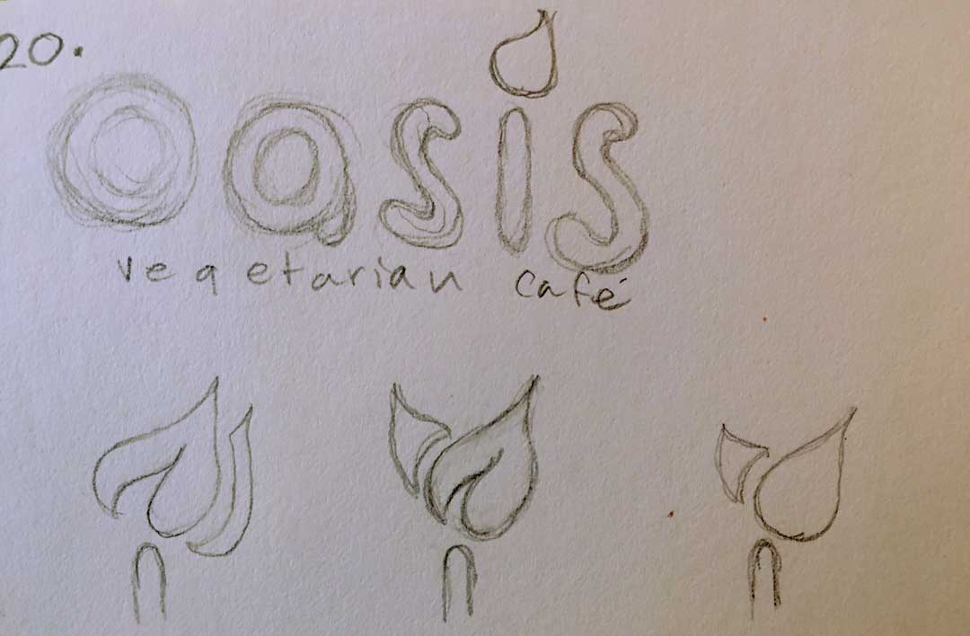
digitized Mockup

Colors
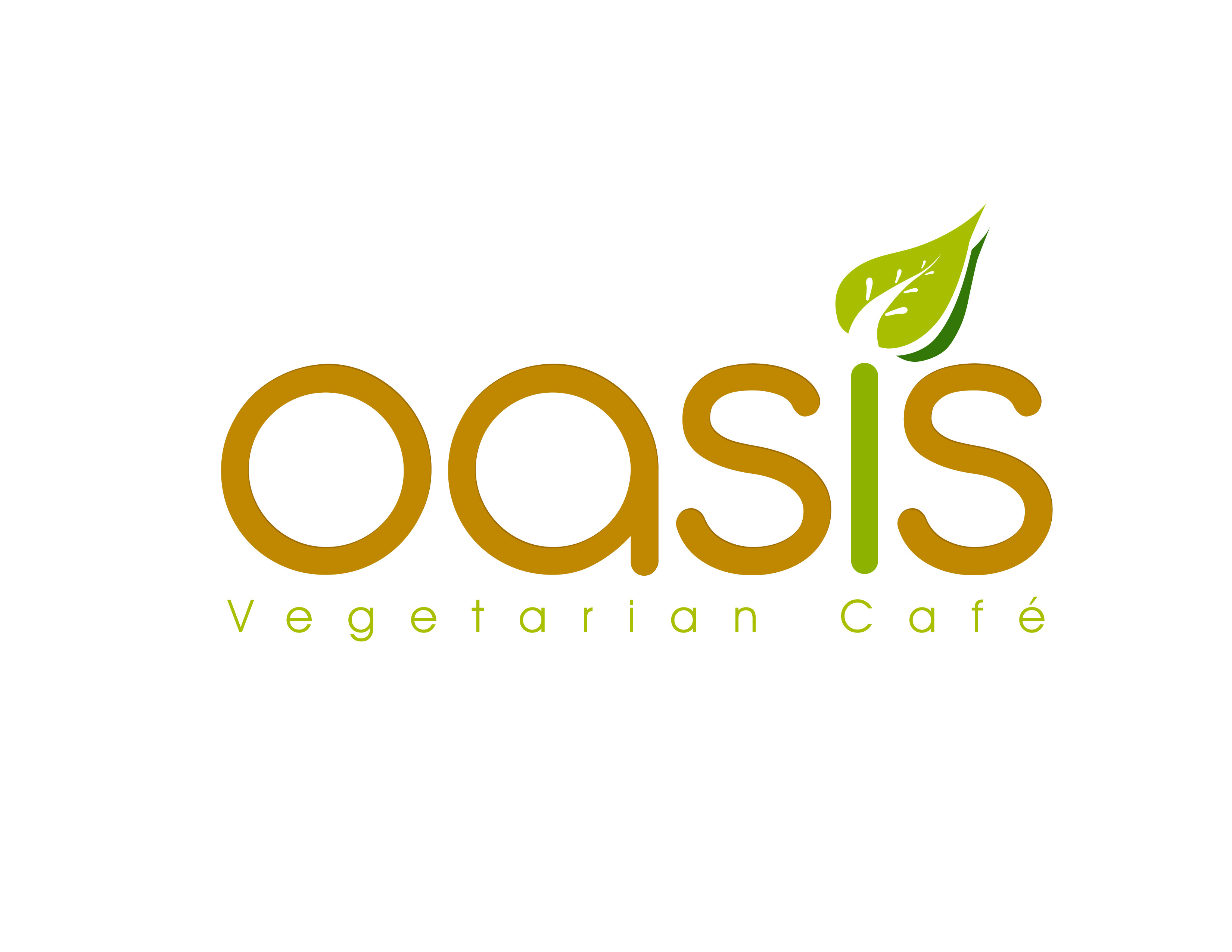
According to my research, people respond well to the color green with organic products. I decided to use light brown, green, and white for the logo.

Finalize Logo
In the final version of this logo, I placed green on the letter "I" for viewers to make a connection with organic, plant based products.
Logo Guide
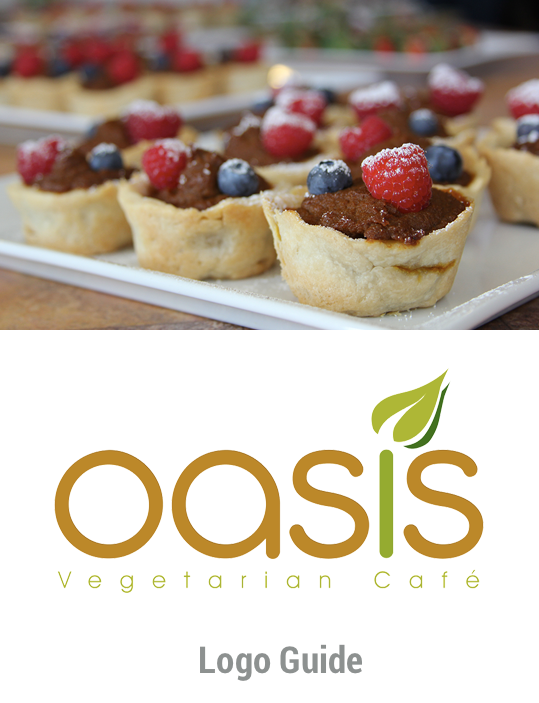
As part of the logo package, I created a logo guide with all the information they need keep the brand and logo consistent throughout their marketing projects. This book includes print & online specifications, and many other things requested by the team.
Distribution
Brochure
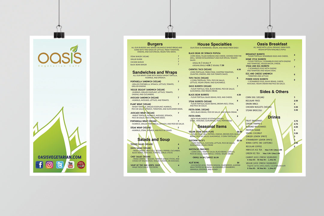
One of the first projects I've done for them is the brochure. I worked closely with Branko on food item names, price, and overal branding visual. The pieces were meant to placed on the order desk, tables, and delivery service. Oasis wanted to their customers to familiarize their food offerings before they order- it helps streamline their food prep time.
Business Cards
The next project was to design the business card for a few Oasis administration members. I designed these cards to be consistent with the brand and stand out. I also added a QR code to drive traffic to their website.

Table Top Fliers
The next project ws the tabletop fliers. These were used to advertise news, notifications, and social media contests. These fliers are double sided and placed on every table. The social media contest seen on the photo been successful since its launch and helped increase online followers, online engagement, and business awareness to the community.

Coupon Cards
Another project I worked on was coupon cards. These cards were aimed towards local surrounding businesses near Oasis. We personally dropped them at targeted business within our community. The results were successful when we received several phone calls after a few days of distributing them.

Indoor Welcome Signs
Another project I help create were the welcome signs. These signs were placed throughout the grocery store help visitors know where Oasis territory begins and ends. Since Oasis indoor seating is located inside the La Sierra Natural Foods store, these signs are helpful to visitors.

Email Sign-Up Cards
Another print project was the email sign-up cards. These cards were placed at the order counter where visitors can see it. At the end of the first week, there were 30 signups. The store averaged 40 sign-ups per month for the rest of the year.

Review

Pablo Fernandez, MBA
CEO of Oasis Vegetarian Cafe
5 of 5 stars
We truly appreciate Rene's insight and work at Oasis. He is incredibly helpful, funny, and enthusiastic throughout his time with us. I wholeheartedly recommend Rene for future projects.