RENE FLORES
Loma Linda Academy Fair
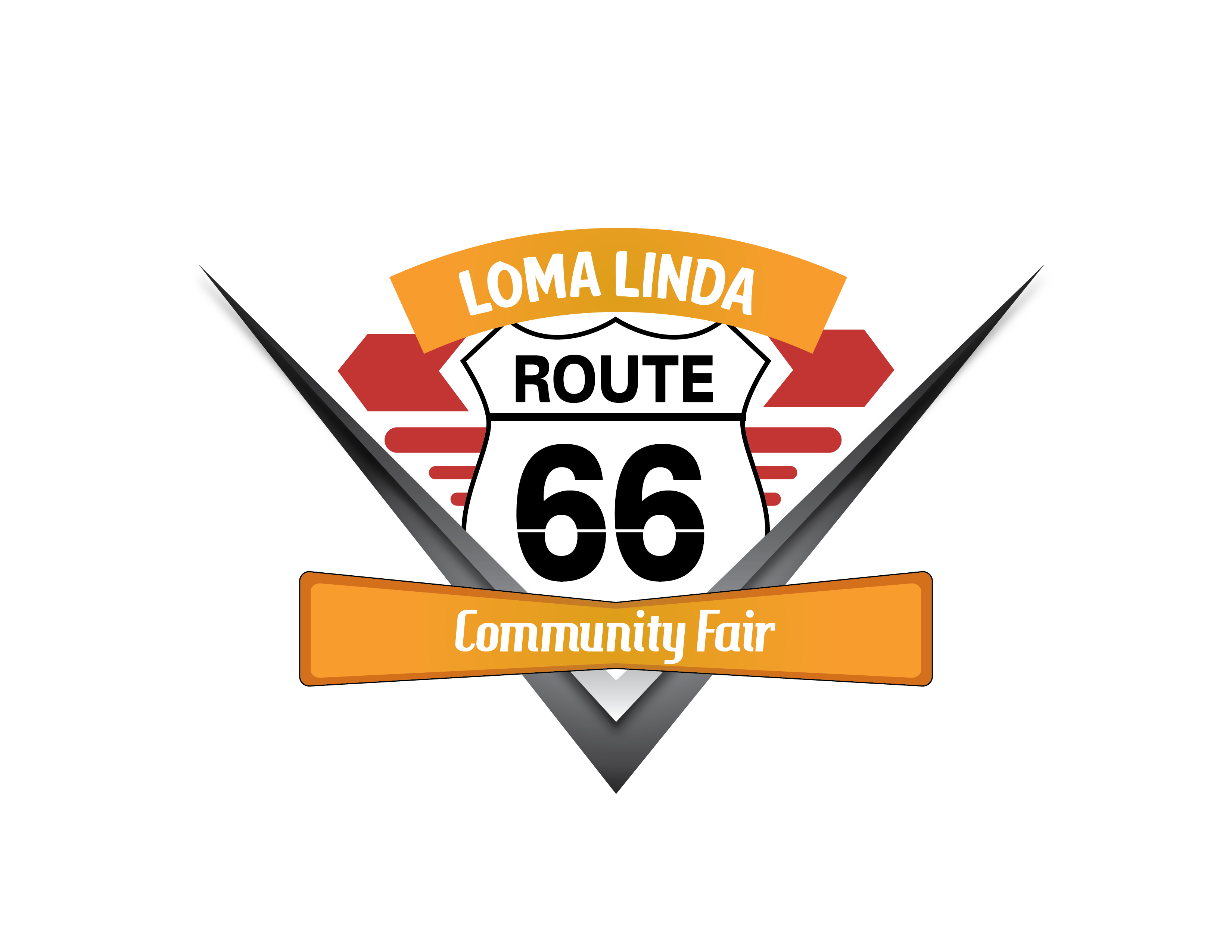
During my time at Loma Linda Academy, I had the opportunity to design a logo for their annual community fair. Not only is it known as one of the biggest events of the school year, it is also one of the most important events of the year because it connects with the local community. Additionally, it also serves as advertising for the school through word of mouth and social media. The average attendance is around 1,500 people; therefore, our school would usually need about 60 staff, faculty, and students to make this event possible.
Lisa Corrales, the fair coordinator for the year, and I worked together on this major project. The first task was the logo and the Route 66 theme. We also discussed the entire project timeline and had a week to create the logo. She outlined the following things the logo must reflect:
Promote LLA Fair to the local community
• Route 66 theme
• Must be recognizable
• Easily Visible in any size
Brain Storming
I wrote down the top 20 words that related to the logo, then narrowed that list down to five words. I used these remaining words to visualize what the logo may look like.
Promote LLA Fair to the local community
• Route 66 sign
• Radiator Springs
• Fall colors
• Diners/desert roads
Image Inspiration
Next, I gathered five to seven images based on my top ten words. I carefully eliminated all but the two best images to use as the source of my logo inspiration. As you can see in the image below, the source of my inspiration came from the landscape, Flo's V8 sign and the shape of the motel sign. I also used the car grill on the second image for the source of the logo inspiration.
Sketch
I sketched ten drafts for presentation to Lisa. The one we selected had a travel vibe with a clear indication of a Route 66 theme. Also important was the fact that it can be seen from a few feet away on any printed or digitized medium for distribution.

Finalized Logo
I often choose five colors and then work down to three; however, in this case, I kept all five colors because they had stronger contrast than three colors. I decided that desert colors of red, orange, and grey worked well together. Once I finalized the logo, Lisa approved my work and we moved on to the distribution phase.

Digital Marketing Campaign
This logo process is part of the Loma Linda Academy marketing campaign I lead.

Review

Lisa Corrales
LLA Fair Coordinator, 2016
5 of 5 stars
Rene is an excellent designer. Working with him had been a smooth experience. He is understanding, efficient, and gets the job done in a timely manner. I'd recommend Rene to anyone who's looking for a high quality graphic designer.

